Showing posts with label User Interface Design. Show all posts

2008/06/24

Better be deaf

As promised, today, I am going to share with you an amusing anecdote which demonstrates how a poorly designed user interface can ruin a good and simple system into something which is hardly usable.

I already talked you about my elevator front panel. I know another device in my apartment building which deserves, I believe, some words: my entry phone!


In fact, my entry phone has nothing special compared to the other entry phones in the building. They are all the same. Its usage is also very usual. Each phone is connected to a microphone located at the entrance of the building. When a visitor wants to enter the building, she presses a button close to the door. The host hears a short tone melody which warns about the presence of a visitor. The host comes to the entry phone, and speaks into the microphone to the visitor. Eventually, the host lets the visitor enter the building by pressing another button. As I said, nothing unusual.

But the entry phone has a second functionality. There is also a ring at the door of the apartment. That ring is connected to entry phone as well. When a visitor rings, the host hears a melody which warns about the presence of the visitor (deja vu?). The host comes at the door, looks into the peephole, and eventually opens the door and welcomes the visitor.

Perhaps you already figured out what is the problem: the tone melodies. In both the scenarios, the entry phone plays a tone melody and there is no easy way to know where the visitor is: at the entrance of the building, or at the entrance of the apartment. One could argue that any visitor will first come at the entrance of the building, but it is no help for several reasons: the entrance of the building was sometimes left unclosed by a previous visitor; or you are sometimes visited by your own neighbor; or some people are actually visiting all the inhabitants so they need obviously to enter the building only once.

At the beginning, I did believe it was only me. Perhaps I have a bad sound memory, or perhaps I would finally learn for what event is each melody. But surprisingly, ten years after, the problem remains the same. Each time the phone entry plays the little music, I don't know where to go: at the entry phone or at the door. My wife does experience the exact same problem. But it seems my neighbors too! A few weeks ago, I needed to talk to one of them. So I rang at his door. After some seconds, I clearly hear my neighbor not too far behind the door trying to vainly speak in the entry phone: "Hello? Hello? Who is it?" So I just knock at the door to tell him he should stop speaking alone in the microphone and come at the door instead.

The fact is that the system exposes two different features through a problematic user interface:
  • It uses a single communication channel: sound. No light, no display, nothing else. But it's not the worst issue, as most of the existing user interfaces do the same without any major problem (phones, traffic signs, and even software applications which most of the time, focus on visual user experience only.)
  • Both the features are exposed through symbols (the melodies) which are totally disconnected from their meaning. They do not evoke anything. They are just a short abstract series of unrelated tones without any semantic. You have to be very imaginative to be able to associate them with one feature or another.
I am unsure what solution could have been chosen to design an effective interface for that system: visual support, multiple sound source (at the door and at the entry phone), better distinct melodies, artificial voice? (I'm a bit reluctant about using artificial human voice when not absolutely necessary. It tends to be quickly irritating. This is something I will probably come back later in a future post.)

What I know for sure is that the designer should have issued a meeting notice for some brainstorm with his colleagues.

2008/06/16

Oversimplification

The lead developer of NDepend, Patrick Smacchia, explains what he considers a key to a successful interface design:

Make the simple things simple and hard things possible. IMHO, this tenet applies perfectly in how UI should be designed. Typically, the most direct way to use a UI control should result in the most awaited feature from a user perspective (make the simple things simple). Then, some extra/hidden UI control facilities can be added to the control to support more in-depth scenario (make hard things possible).

But achieving simplicity in interface design is everything but an easy task. A common mistake (but apparently not so commonly known) is the oversimplification. It consists in an unfortunate too low threshold in what the designer considers simple things and hard things. It's an error because it may lead the average user to frustration. Every time she needs to activate such a designated "hard" feature, although she would consider it as a basic feature, she has to manipulate a more complex interface to access to the hidden functionality.

A good example is the automatic collapsed/expanded menu of Microsoft Office 2003. Why features like text replace or page setup were put by default in the "hard things" list? The authors have apparently decided that those functionnalities are less commonly used. Perhaps it is true actually, for most users. But what about people who, for a reason or another, needs to use them twenty or fourty times a day?
But generally speaking, determining what is simple and what is hard is a difficult task; especially if you target a wide audience from the modest grandma to the tech geek. Mitigation is always possible by providing some options for personal customization, or automatic adaptation based on the most frequently used commands (like the menus described aboved, in fact). But in the real world (I mean the non-IT world), this is sometimes just impossible. Look at this remote control device I saw recently in a paper advertisment.


Although very simple, the idea is great and not so common for that kind of device. When folded, it presents just a few buttons for the very basic features: turn the TV on and off, change the channels, etc. Only when unfolding it, you can access to the advanced functionalities. One can suppose that a feature like video recording or TV internet access is probably only accessible from inside the remote control. This is surely not an issue for grandma. But for the tech geek, after all, it’s perhaps not a so well designed device.

Think twice about your audience and its level of expertise before implementing such a solution, whatever your system is software- or hardware-based.

2008/06/09

Turn right... but not so much!

In his excellent blog, Jeff Atwood already talked several times about road signs in the perspective of user interface design. Indeed, as a professional software developer, I have occasionally to design interfaces (end-user panels, API, or frameworks); and I share the fascination of Jeff for road signs and for symbols usage in general.

In a previous article, I already made an analogy between road signs and software interfaces, about the necessity to design consistent models.

But even though you follow your own design rules and make a consistent interface, you still have make a proper usage of it. Let's continue our analogy with traffic signs and look at the following picture I took recently there.


So what? Obviously, you must turn right soon. But why installing two nearly identical traffic signs located at 10 meters from each other. The first sign indicates that the road turns 90° right; but a few meters later, it's only 45°.

According to the local driving rules (Page 121), the two signs have actually the same meaning: they indicate to the drivers the obligatory way(s) to follow according to the direction indicated by the arrow. So in fact, I cannot see any logical nor legal reason for the presence of those signs with a different arrow.

This example is a perfect illustration of an interface with a good design (simple sign intuitively understandable) but used improperly or inconsistently. Or did I miss something ?

2008/06/01

Written interfaces and localization

I live in a non-English speaking country. Although a significant part of the population can speak English a little, the vast majority of it does not know a single word. This is the case for my wife. She perfectly speaks Portuguese and French, and she has some solid notions of Italian and Spanish, but no English at all.

Of course, there is nothing wrong. The most annoying for her is the plethora of little devices we daily uses (computers, recorders, music players, etc.) and which have been designed for international marketing but without any consideration for localization of the user interface. Look at that radio alarm for instance:


Each time my wife wants to change the settings, she has to ask me whether she must switch it on or off. That is because she has no idea what "on" or "off" means. For her, it could be so well written "sglurmf" and "zxqwaghs"! Without any reference, it is very difficult to remember a foreign word and its meaning.

In the IT world and especially on the Internet, the possibility to switch between languages is so common that we do not notice it any more. But unfortunately, it is not so easy for non-software user interfaces.

2008/05/26

Unfriendly traffic signs

In Europe, like in North America, and like in many other regions in the world, everything seems to be have been built around the concept of car transportation: from the location of the buildings and how they are designed, to the daily social organization of everyone. This has an unexpected but important consequence which is directly in relation with user interfaces.

As a driver, passenger, cyclist or simple pedestrian; in a large city, or in the countryside; we are literally surrounded by traffic signs. Everywhere. From the largest highway, to the most modest track suitable for vehicles. It might be surprising, but traffic signs are actually user interfaces. They represent an interface between the travelers and local authorities, by communicating about potential risks, limitations, and other pieces of information. But like any other kind of user interfaces, traffic signs need to be well designed.

In the driving school, I learnt a simple rule which helps understanding most of the traffic signs found in several countries of Western Europe. Consider the shape and the dominant colors of any sign.


  • A white disc surrounded by a red border forbids.


  • A white triangle surrounded by a red border warns about a danger.


  • A blue square informs.


  • A blue disc constrains.


Great, isn't it? It seems so easy. Most probably, a similar set of rules exists in your own region. Next time you travel in car with children, you can propose to them a funny game. Explain the rules above, then let them imagine what is the true meaning of each traffic sign they will see. Thanks to the shape, the color and the symbols inside the sign (most of them are relatively pertinent); and with some little help, they should quickly find intuitively the correct answer.

Unfortunately (and this is actually the real point of my post), you will also very quickly meet some signs which do not fit into any of the categories described previously. It's not a disc, nor a square; unexpected color, obscure symbol. No chance to "guess" the real semantic, if you don't know it already.


Worse, those four signs represent about 10% of all the signs installed all along the roads. My question is the following. Why having created a very nice set of rules which apply only to 90% of the traffic signs, and let all the remaining elements with a complete customized and chaotic style? Does it make really any sense? In fact, I have no answer concerning that specific example; but there is a moral to this story. It is applicable to software engineering, but probably to any other engineering discipline as well.

As a designer, you have to establish rules and principles which will describe the general working and the usage of your system. But you have also to apply those rules from start to finish. Do not suffer any exception. It is commonly accepted that exception proves the rule. But I think it's only an easy excuse to not refactor your work when it needs to (Agile followers will appreciate the generalization of the concept). If things do finally not match well to the rules, it is usually a smell of poor preliminary specifications. Change the things or rewrite the rules, but make easier the life of your future users. As a designer, if you don't follow your own rules, who else?

2008/05/20

Easy symbols

Symbols are very important in user interfaces. Due to space constraints, the designer often needs to represent concepts with symbols. They usually act as visual or auditive shortcuts (I have a funny anecdote about an exclusively auditive interface, that I will soon talk about in a future post.)

Recently, I had to work on the conception and the development of a large software project with a very significant user interface containg a lot of forms and panels. In order to improve the usability of the system, I decided that I would need a nice but simple icon library to decorate the interface.

Being not a graphic designer, I have found a simple way to quickly create such an icon library.

1. Get a basic and sober icon frame. You can find plenty of them for free on Internet.


2. Open the frame image in your favorite image processor.

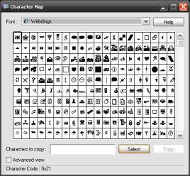
3. Add a new layer above the frame, then write a character with any symbolic font such as Webdings or Wingdings.


4. Add a shadow or some other effect. Et voilĂ  ! In less than 10 minutes, you get a nice set of icons you can extend and vary ad infinitum.

2008/05/16

The elevator front panel

I live with my lovely wife Jacinta in a nice duplex located at the third floor of an apartment block. We have bought it some years ago. The building has 4 floors. But surprisingly, when entering the elevator, you are faced with the following panel :

One could say it is just funny. But my opinion is that having a complete 10-digits pad and a 3-digits display, to only just move between floor 0 and 3, is plain stupid. Realize that 70% of the panel is completely useless !
If you look carefully, you can even see a dot key! Frankly, I have no idea what usage such a key may have in an elevator. Perhaps someone could desire to go to the floor 2.5 ? Earlier today, I made several trials. And fortunately, the elevator had silently rejected my request to visit hell when I typed -666.
More seriously, the reason why the architect took the decision to install such a panel, is far beyond my understanding. But there is a lesson to remember.

When designing a system, you do not have always the possibility to create yourself a dedicated user interface. Sometimes, you have no other choice but to apply an existing template. Should this happen, do not follow the famous proverb which says "He who can do more can do less". In term of user interface, this will lead you inevitably to a failure. As Patrick Smacchia explained recently in his excellent blog about NDepend, let "make the simple things simple (...)". Interface designers should always remember that very sentence.

2008/05/15

A few preliminary words

As the title of this blog might suggest, the main topic of my future posts will be user interfaces. But despite the fact that I work as a corporate software engineer in a large automotive company, I do not intend to restrict myself to software interfaces. In fact, I would like to speak with you about all the kind of human/machine interfaces, which we, as human beings living in a modern society, have to deal with daily... more or less successfully.

I am going to expose my thoughts about what make interfaces good or bad. I will relate anecdotes inspired from my professional experience, but also from my private life concerning all those funny, stupid, or amazing interfaces which allow (or sometimes prevent) us to interact with the rest of the world. We will also try to have a look at what and who is hidden behind interfaces.

I hope you will enjoy that blog as much as I will enjoy writing it.

See you soon...